Amazon Web Redesign

Oct 2019, Independent Project, Web Redesign

This project aims to simplify the process of purchase decision making on Amazon.com. Started from individual and group user interviews and usability inspection to define problems, developed wireframe and 3 design proposals, conducted user testing to choose one concept to develop the final design. It was a independent project completed in 9 days.

Summary


Issue
Amazon users cannot process informaiton and make purchase decisions effectively and enjoyable.

Barriers
Information/cognitive overload, distracted layout, multi-step purchase flow, no memeory support.

Solution
New page with elegant and clean design, simplify the information processing and decision making.

Success Metrics
9/10 testers claimed the new design helps them process information and make purchase decisions easier and faster.
Process


●   Discover User Interviews, Usability Inspection ●   Define Problem Focus, Product Requirements ●   Develop Wireframe, Design Proposal, User Feedback ●   Deliver Final Design, User Testing ●   Reflect
User Interviews

I interviewed some friends to understand their experience on Amazon.com, and summarized their needs.

Usability Inspection

There are some principles I'll use to assess UI/UX design on web product:

(1) Consistency: UI style, behaviors, usability, learnability, language. Can users know and follow a certain pattern to resolve problems?
Does user feel intuitive or confused on actions?
(2) Readability: Scannability, legibility, eye flow, comprehension. Can users scan content and understand concept in 3 seconds?
Can user be focus (not distracted) and have smooth reading flow?
(3) Status Recognition: Feedback(error, process, action), predictability. Does user know what's going on now? where are they?
Does user know what's going to happen and how can they do next?
(4) Memory Support: Recognition, working memory, notification. Can user earn assistance on memorying?
Does it remind users of somthing they want to remember?

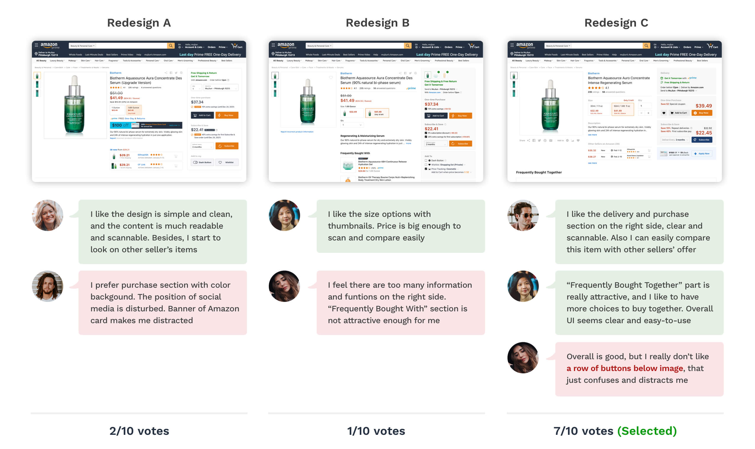
Based on 4 principles above, I found some design in Amazon shopping page that do not match my usability standard:

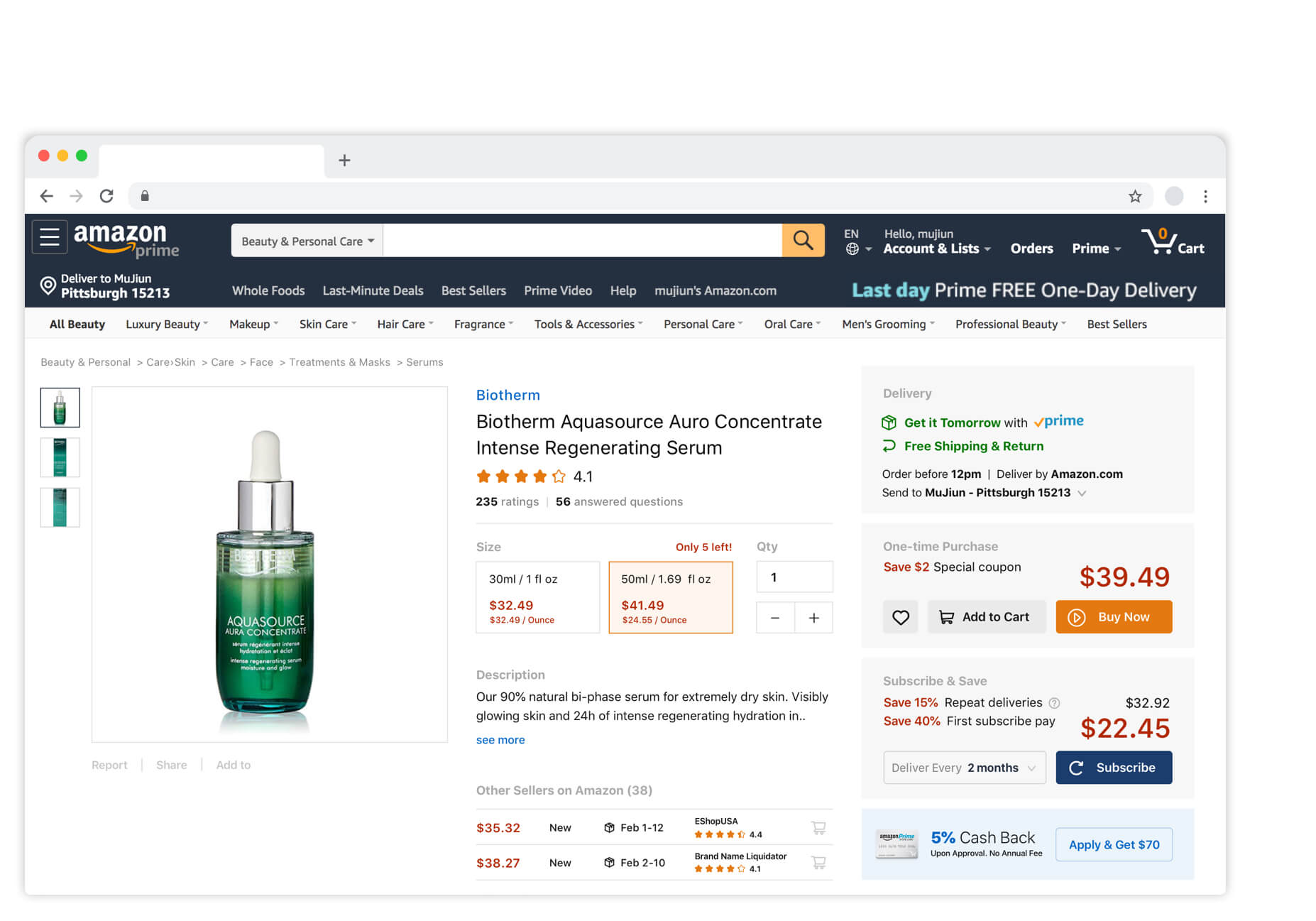
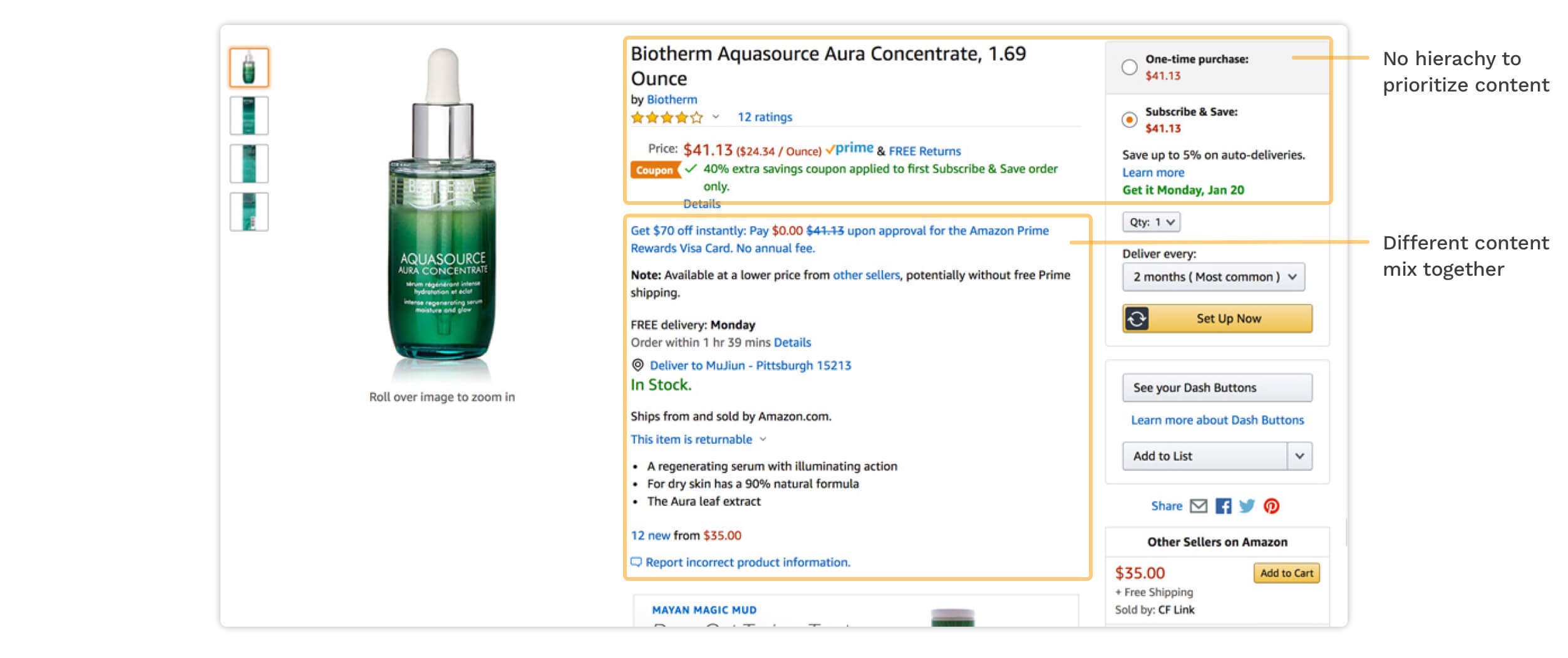
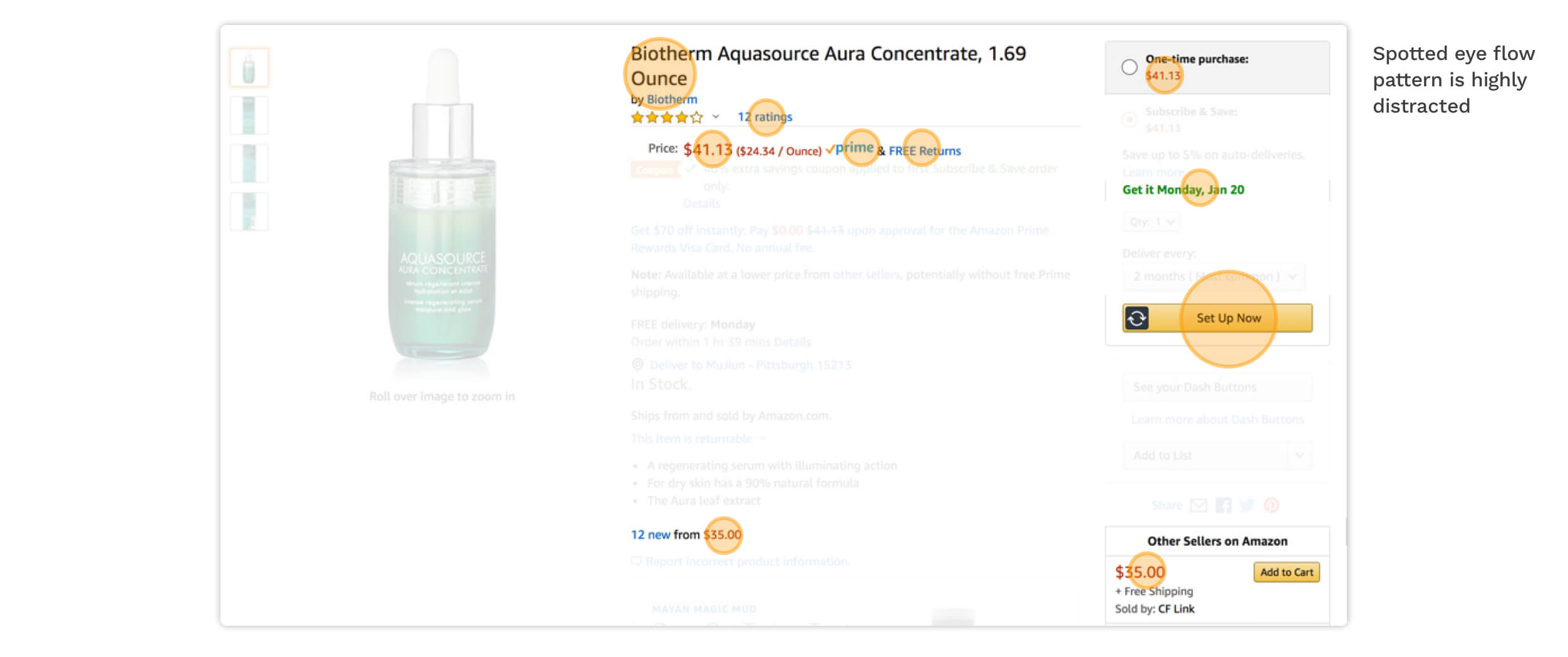
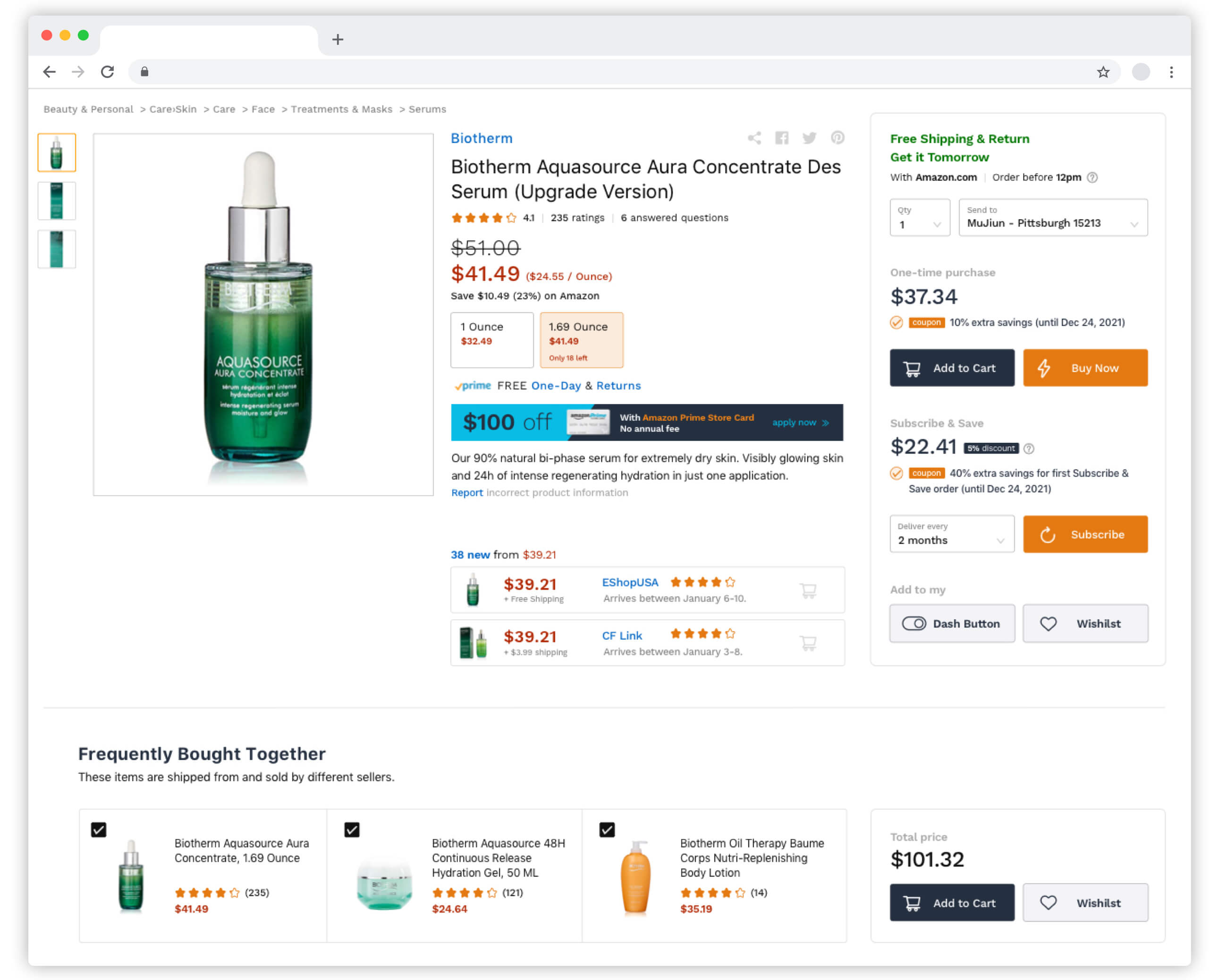
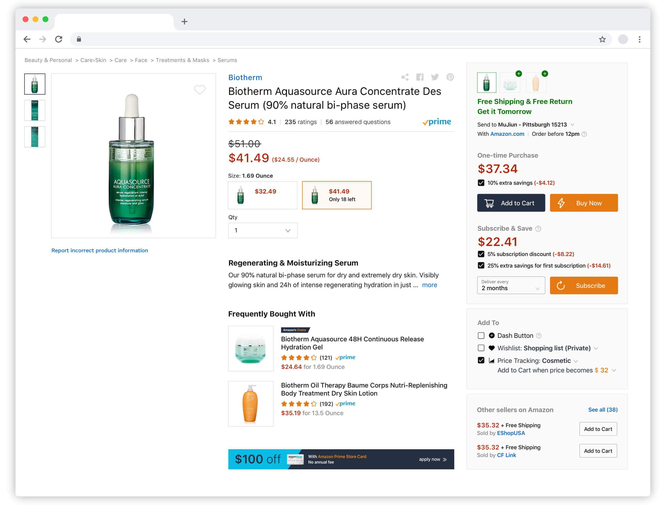
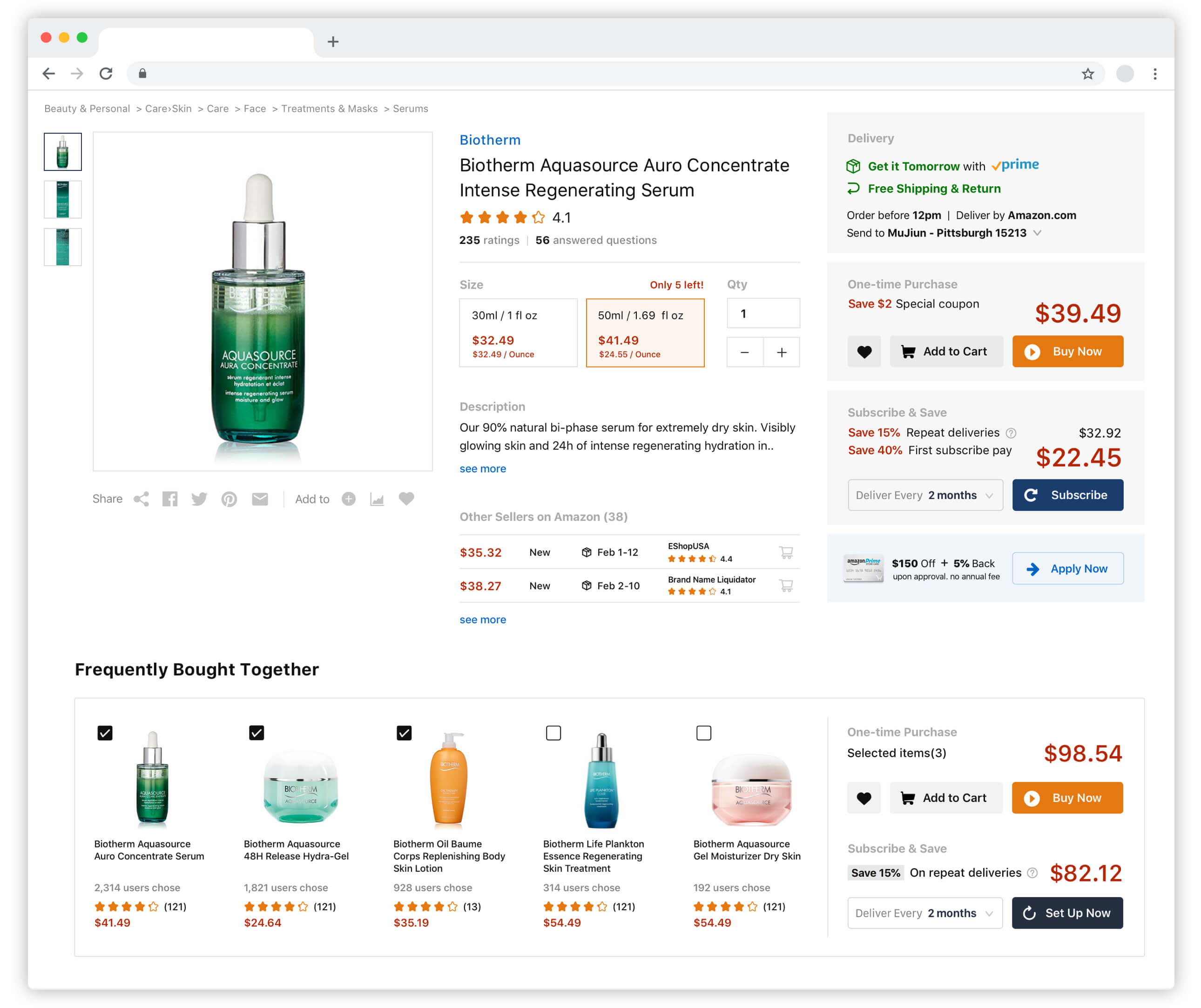
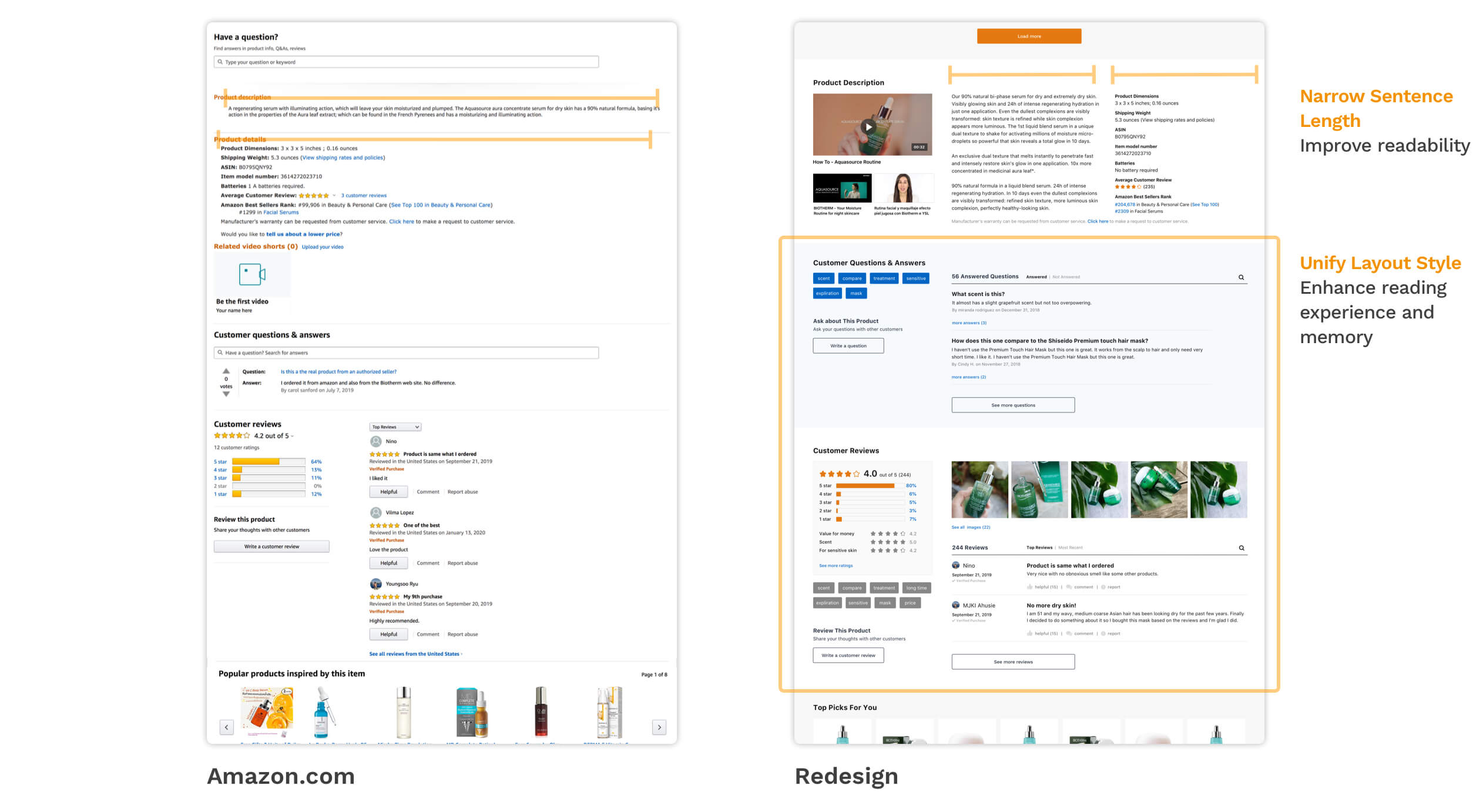
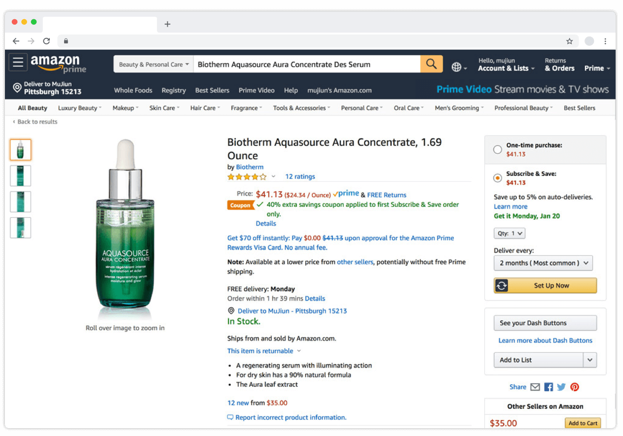
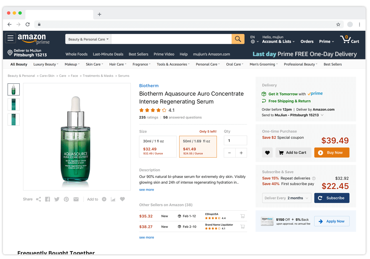
Unscannable content and spotted eye flow lead to poor readability. It lacks efficient visual/information hierarchy, there are too many highlighted texts and links, lack of proper typeface variations. Content is repeated and not concise.

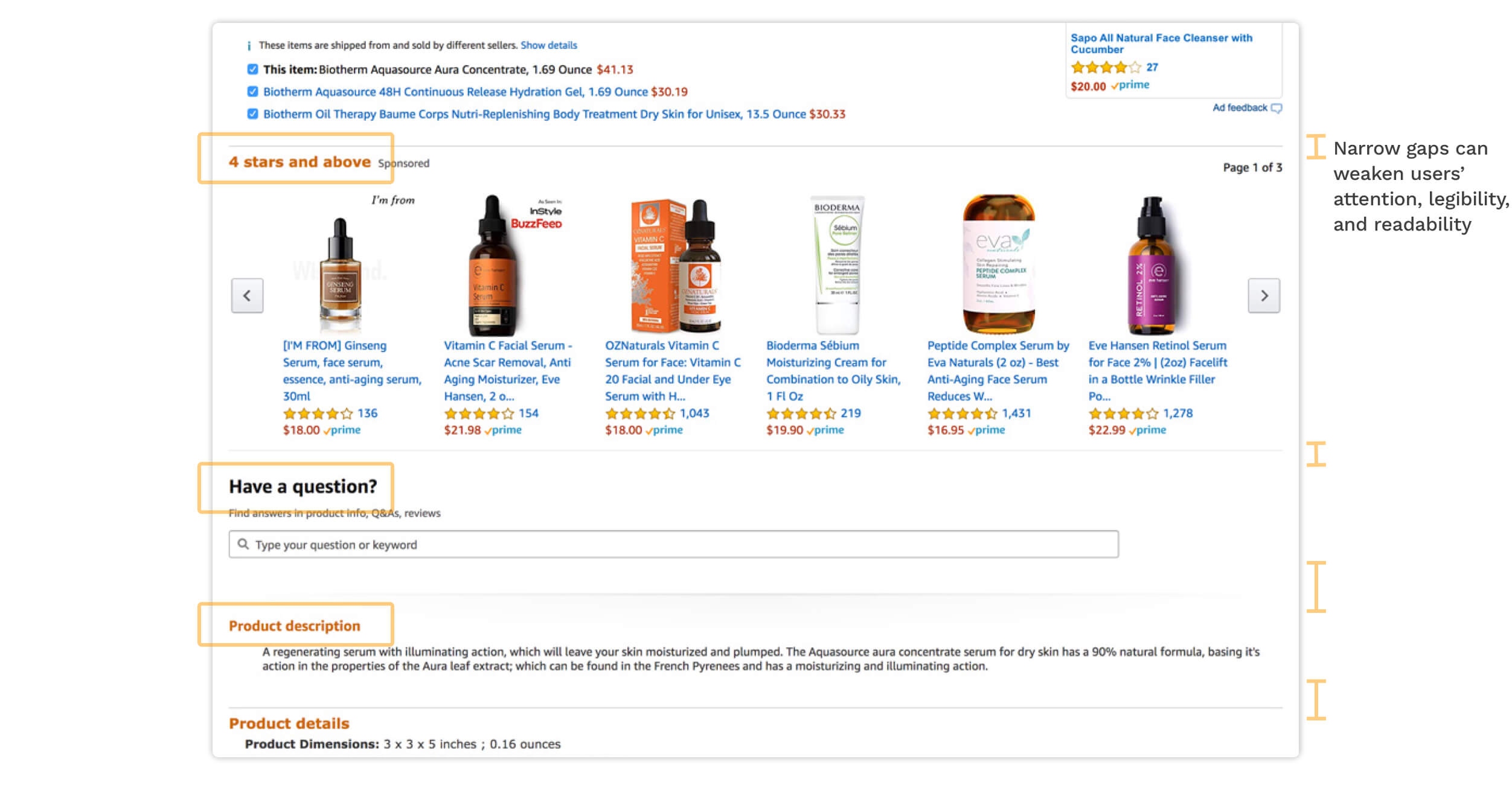
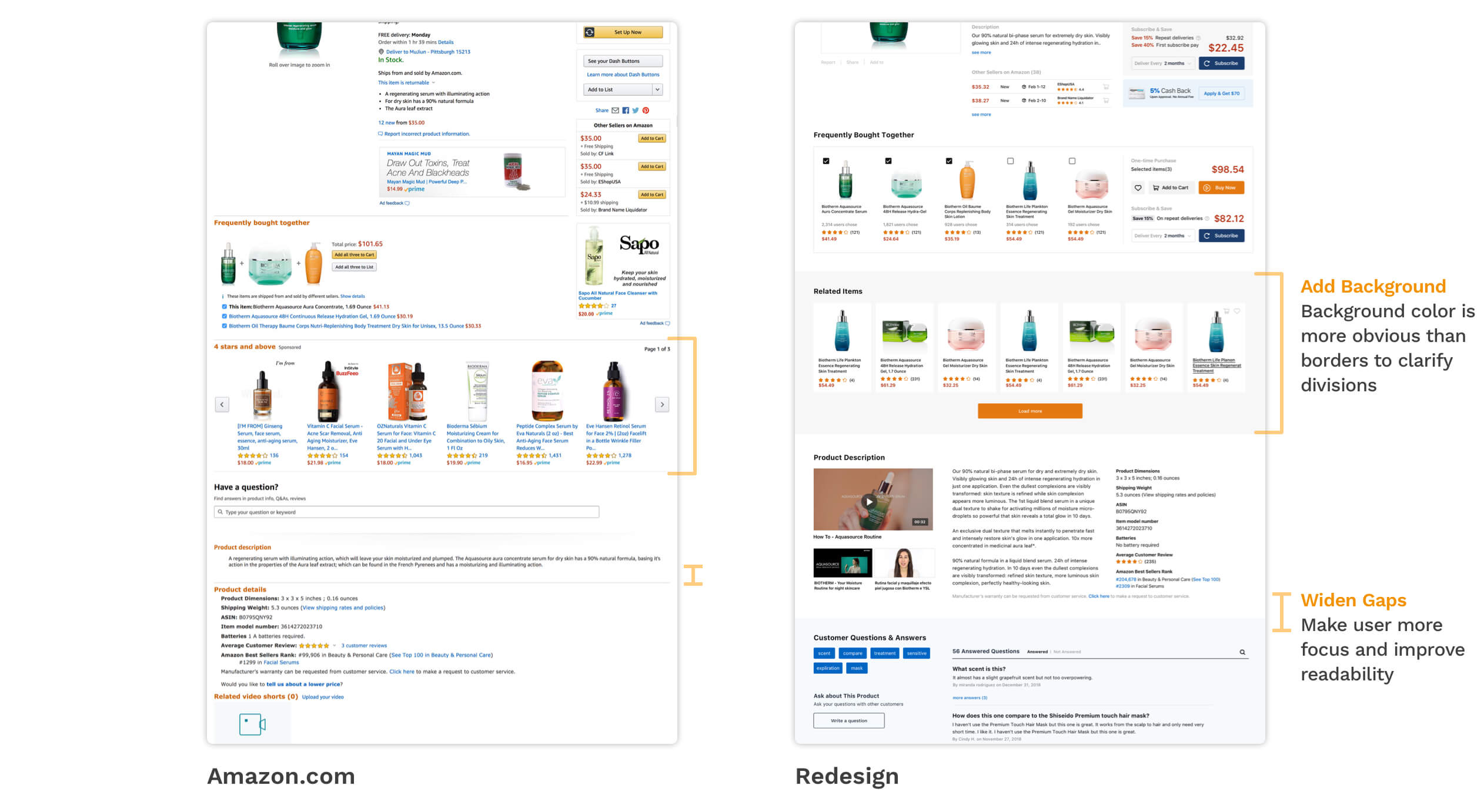
There's no clear recognition between sections. Style of titles, white space, background color, and boundary for sections are not clear enough to divide different sections, it weakens the comprehension and makes user distracted.

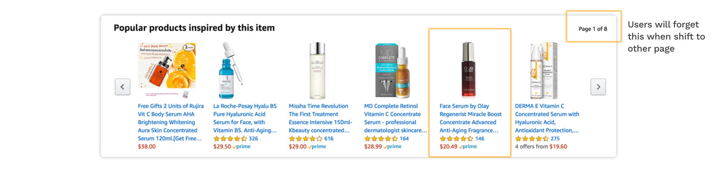
Recommended content lacks of memory support. Amazon uses sliders for recommendations, each slider has 3-10 pages with 18-80 items. However, users can only remember 3-5 items in short-term memory*, without assistance like a marker, the user might not recall the item they wanted after they have browsed many pages.

Takeaway from Usability Inspection -
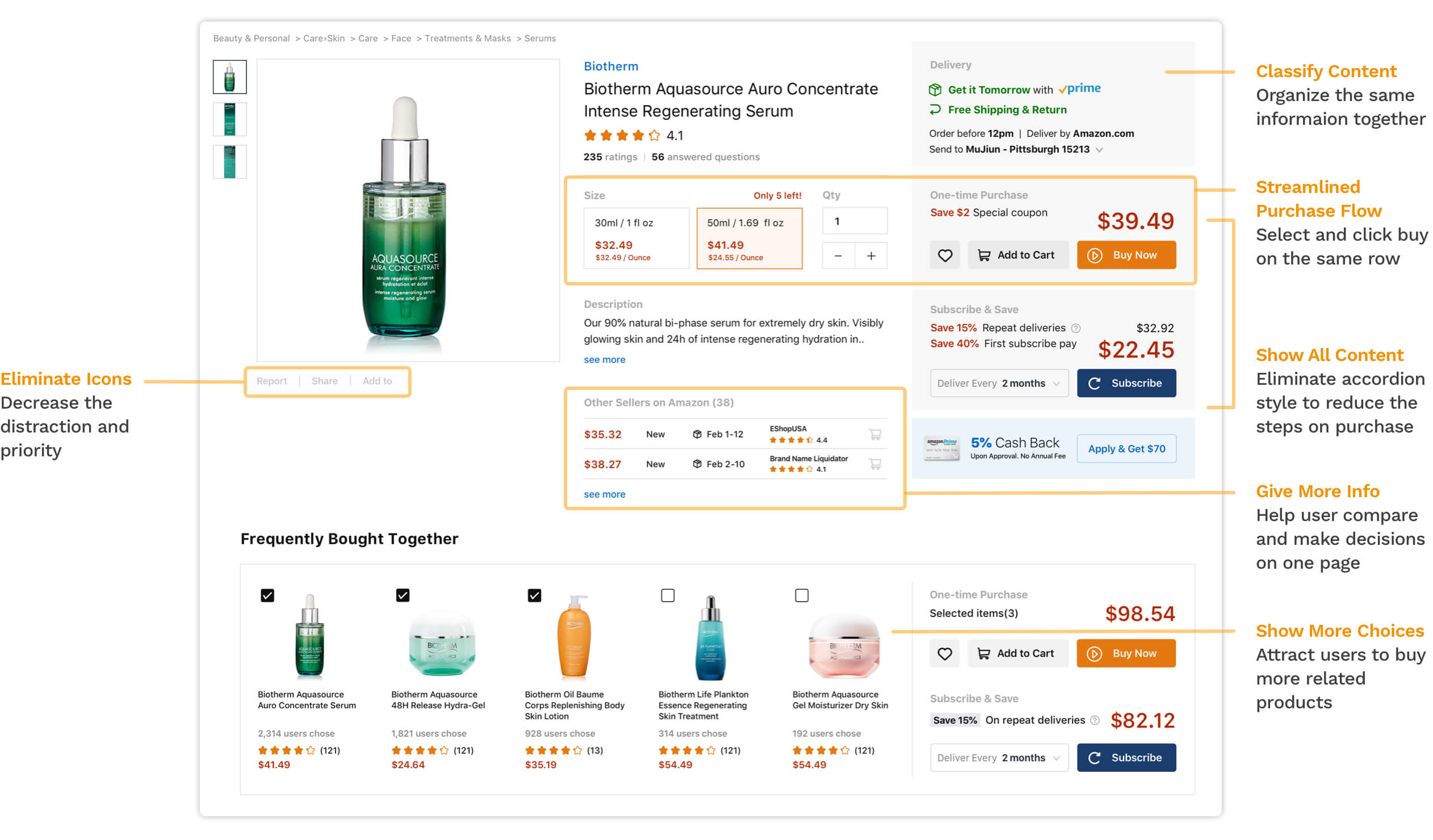
I needed to improve consistency, readability, status recognition, and memory support on page to improve reading and shopping experience.

###
Focus Problems

Learning from interviews and usability inspection, I decided to redesign the page by providing an easier purchase flow and improving 4 design principles - consistency, readability, status recognition, and memory support. The main goal is to help customers reduce time on reading content and make purchase decisions:

Problem Solution
Complex purchase flow. β†’ #1 Provide one-click purchase
Poor readability, unscannable, lack of information hierarchy. β†’ #2 Simplify, prioritize, and reorganize content.
Lack of consistency, chaotic design language. β†’ #3 Reassign or unify style on elements.
Weak status recognition between sections. β†’ #4 Use white space and background color for sections.
No support for memory and decision-making. β†’ #5 Provide save feature and use "show more" on recommendation list.
Wireframe

Developed 3 wireframes with a little different purposes and focuses.

Design Proposal

Redesign A provides more information in other sellers, users can compare packages from the different suppliers easily.

Redesign B puts frequently bought together into the middle description part, users can access to related items faster, and add items on purchase area.

Redesign C makes purchase flow/actions on the same row, it provides linear, one-time purchase that help users focus on purchase decisions.

User Feedback

I Interviewed 10 people, provided user testing on 3 initial designs. I earned some feedbacks which helped me decide which one to develop further.

Takeaway from User Feedback -
I decided to choose version C, modified and developed based on feedback.

###
Final Design

Final version of Redesign C:

Improve information hierarchy by simplifying content, reassigning style, and rearranging elements. For example, users can easily scan delivery and price by its exclusive color, position, and size. Many interviewees claimed that they prefered to see detailed description later so I decided to reveal less description here.

Help user focus on content and recognize divisions. Background color and white space can differentiate parts more clearly than borders, and also help users focused.

Enhance readability through multiple column layouts. I narrowed the content wide and try to make each sentence consist of less than 20 words, this setting can strongly increase the readability*.

Lessons

Use different user research methods can inspire different conversation and earn more opinions. For example, in the group interview, many attandees claimed that they did not notice the inconvenience and barriers of using Amazon.com until they have that discussion. People might easily get used to one thing and forget the barriers.

Iteration

By modularizing the components, I want to (1) have the A/B test to see which combination could lead to the best result - help user make purchase decision and click purchase faster; and (2) design different modules for other categories on Amazon.com.

END ###
mujiunshie@gmail.com