Design System & Specs Built for Everyone
2018 - 2023, Lead Designer
Build design systems and specs for effective and automated communications by considering different use cases and incorporating front-end coding skills.
Key Takeaways
Impact
Save Eng and UX workload, easier for users to adapt.
What I Thought/Did Differently
- Design for everyone not just designers
- Incorporate front-end coding skills
- Consider readability and navigation
Kudos from Co-Workers
Front-End Devs - "Mu's files were easy to navigate and understand while provided all information for development, we hope this become the standard"
Product Manager - "Mu’s Figma was very clear and made story writing simpler and more efficient”
Process
● Structure & Communicate
Align with team on scope and needs
● Style
Make it easier to maintain with "scale"
● Componenets & Templates
Various status, accessibility, and responsive devices
● Share with team
I've built 6 design systems in 4 of my past jobs and kept iterating my approaches based on learning. Here I will share how I built design systems differently to truly ease team communications and save development efforts.
1. Align scope and share knowledges with designers
2. Talk with developers
At start-ups, I would understand if developers are using any open sources to build CSS framework? At tech companies, I would understand how devs built CSS and framework? Take a look on the stylesheet so we can align on the style setting.
3. Talk with other "users"
Who's the user? Use cases? How's their experiences with Figma, design systems, specs?
It's helpful to estalish shared style in the beginning to save time on design changes -
Step 1 - Set up the baseline in Figma (It's ok to give numbers first and change later)
Step 2 - Share with designer
Step 3 - Collect feedback
Step 4 - Iterate style setting and share with Devs
My approaches to ease team workflow
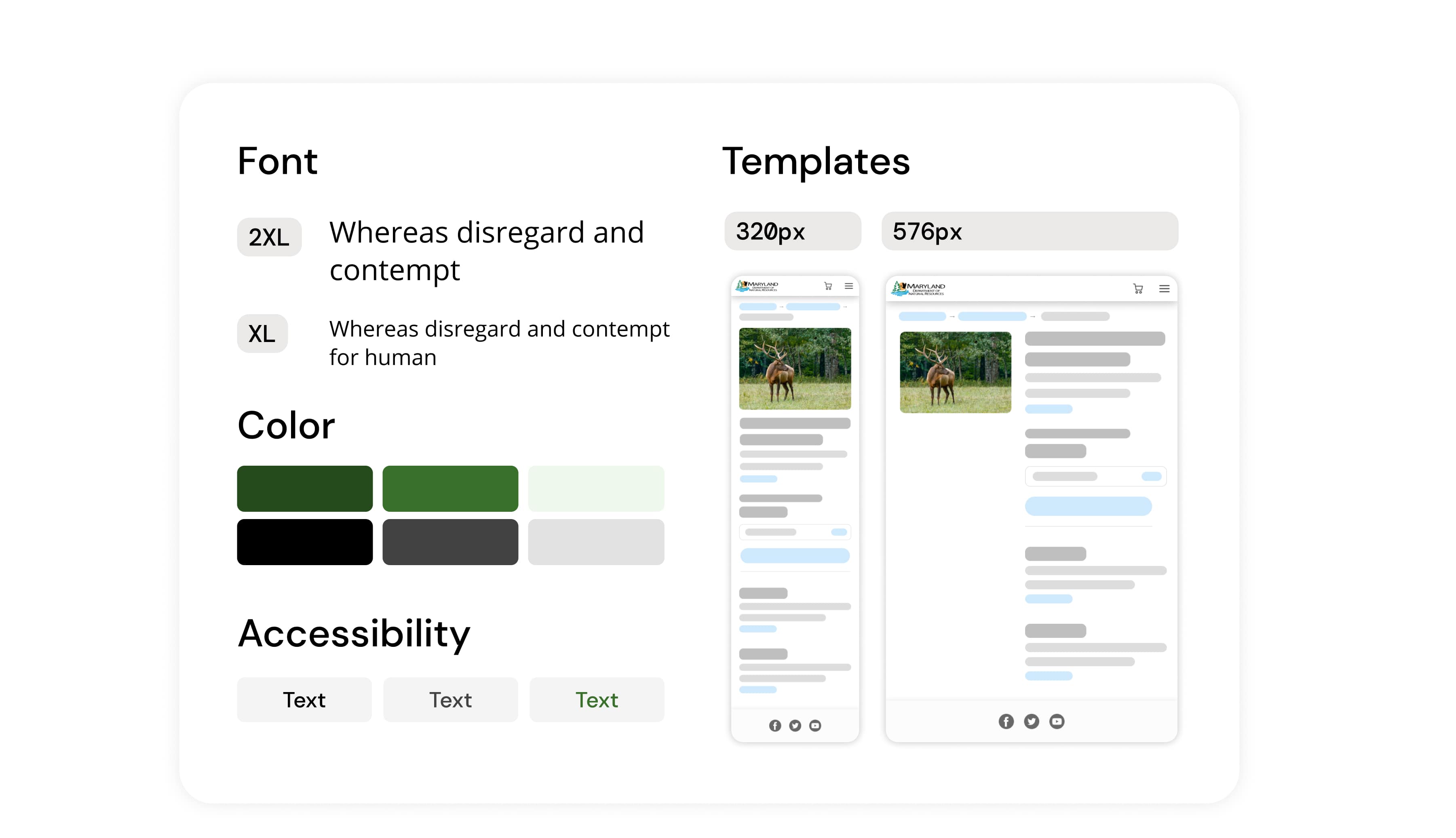
1. Name UI style strategically - Avoid being too specific or conflict with html tags.
2. Use "scale" - Create variants with scale (darken 10%, 1.25 rem) to ease the adjustment.
3. Consider accessibility in the beginning.
Work Examples
Provide good user experience for design system
1. Learned from the past experience to iterate components and ease team communicaiton.
2. Learned HTML/CSS to understand what specs Eng need for development.
Work Examples
Plan for reponsive web experiences when design the page
1. Think about how components move on different devices
2. Provide designs and breakpoints for reponsive web development
By doing these, I've delivered design specs that simplify understanding for everyone.
Create redlines and use established patterns
Highlight new patterns or adjustment
Clarify user flow

