Gmail for Personal

Mar 2020, Independent Project, App Redesign

This project aims to find out the barriers of personal account experience and redesign it to better match personal needs - from doing user interviews, defining problems, to build the wireframe, app design, and prototype, and finally have user testing to validate the idea and iterate it. This was an independent design challenge finished in 7 days.

Summary


Issue
Gmail users cannot process personal emails effectively and enjoyable.

Barriers
Information and cognitive overload, disorganization, formal/business email format.

Solution
New layout for email list, smart categorization and management, personalized email format.

Success Metrics
5/5 testers claimed the new design helps them process emails easier and more enjoyable.
Process


●   Discover Inspiration, User Interviews ●   Define Problem Focus, Product Requirements ●   Develop Wireframe ●   Deliver App Design, Prototype, User Testing ●   Reflect
Inspiration

Email messaging was invented in the 60s and became widely used among universities, military, and businesses in the 70s for its cost-effective to exchange formal, text-based information. Now, Gmail dominates consumer email with over 1.5 billion* users.

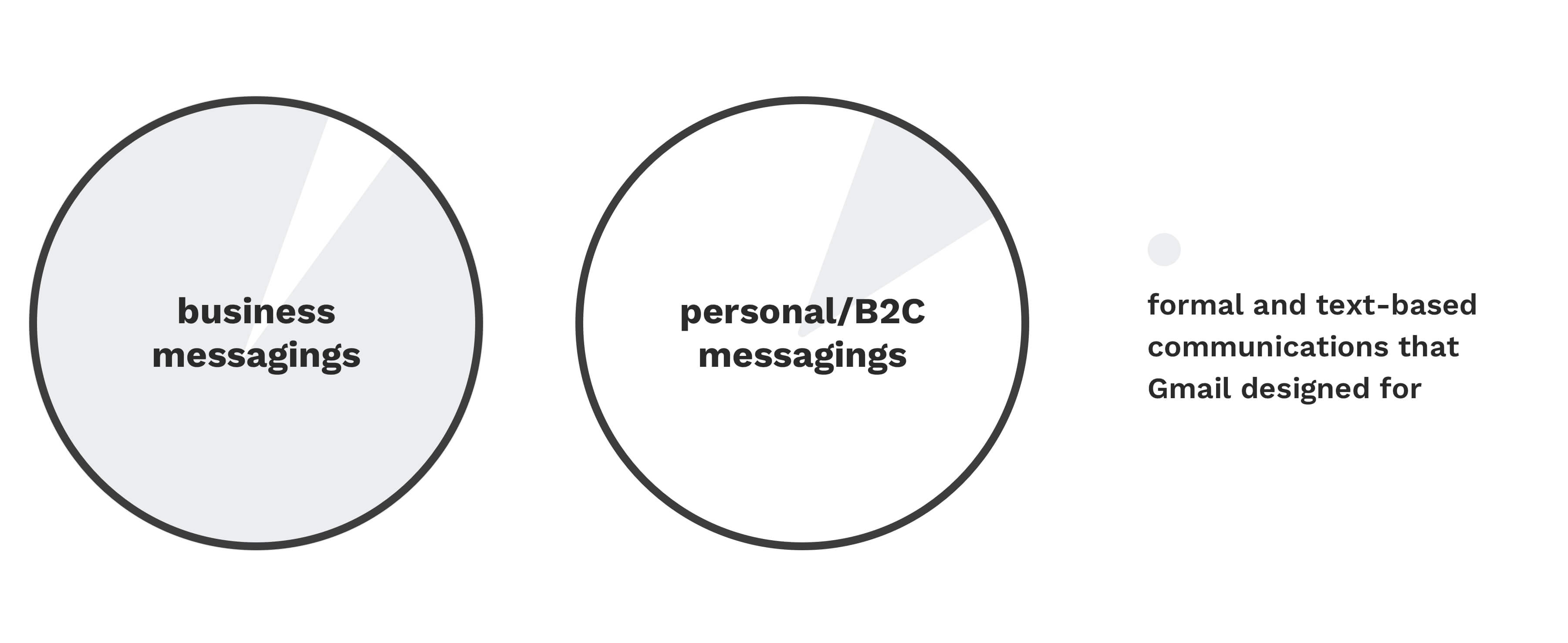
As people rely more on the digital world, Gmail becomes a crucial tool to get information and documents for personal use. However, users feel frustrated when process personal content. Gmail was initially designed for formal and text-based communications while personal/consumer messagings and documents are diverse and customized.

One format cannot satisfy both business and personal communications. Next, I decided to explore the barriers and limitations that personal account users encounter when process personal/B2C messagings.

User Interviews

Interviewees

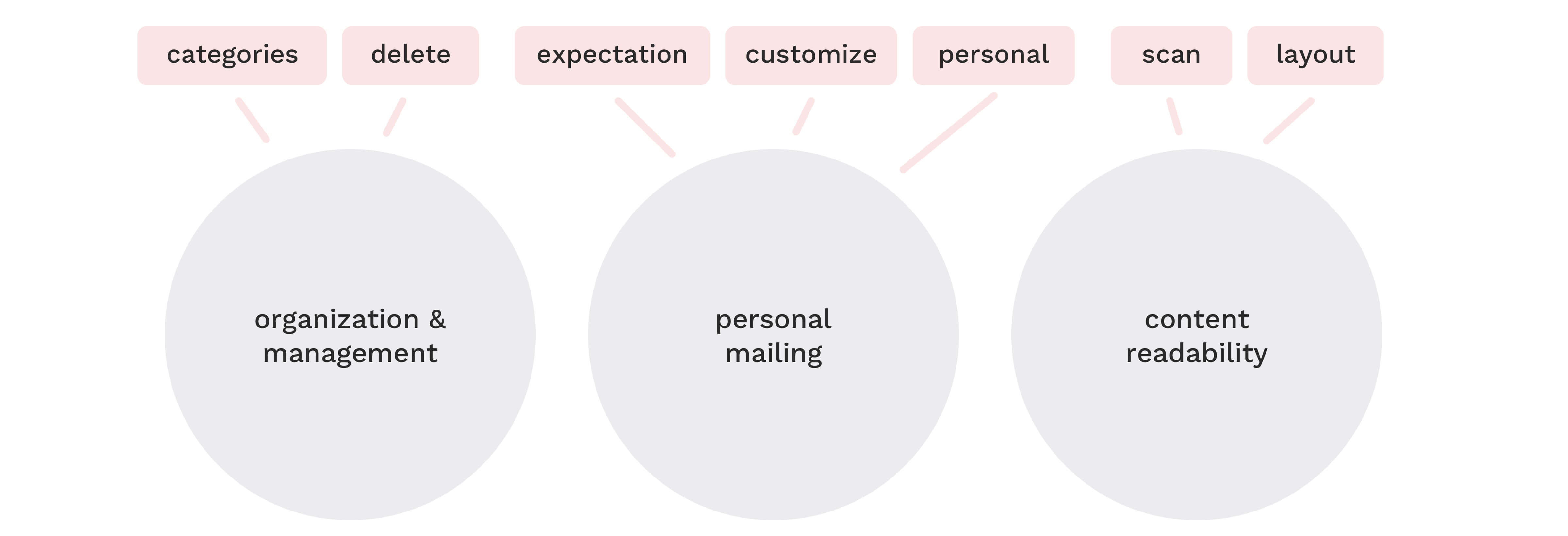
Interview topics and barriers that interviewees have -

8 Types of messagings in personal mailbox and actions -

Experience that personal account users expect to have -

Takeaway from Inspiration & User Interview -
Gmail is designed for business use, but the need for personal use is emerging. Personal account users experience multiple barriers related to process and manage the diverse type of emails and customize the personal emails.

###
Focus Problems

Personal account users want to scan information and organize diverse emails easier. People don't write personal emails in business format, they want to customize it.

Barriers Solutions
No motivation to write personal emails, and no expectation to check Gmail. β†’ #1 Mimic physical mailing experience to augment personalization
Disorganized mailbox, limited auto-categories, inefficient delete. β†’ #2 Provide more categories and actions to manage diverse types of emails
Cognitive and information overload, tired of reading through diverse layout. β†’ #3 Tailor list layout to scan and process diverse type of information
Wireframe
App Design
Prototype
Product Features
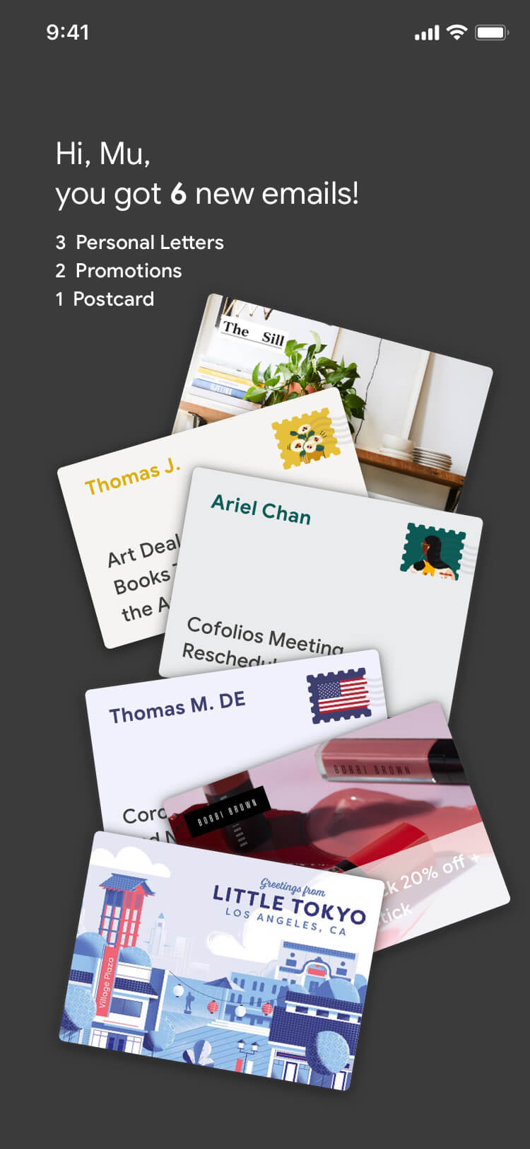
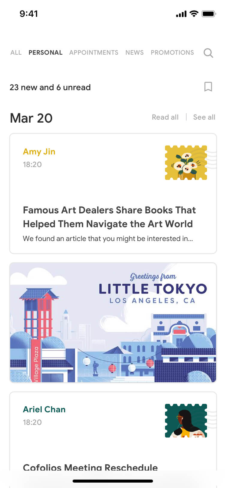
#1 Mimic physical mailing experience

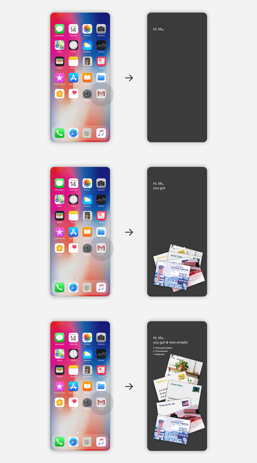
Unwrap surprise when open Gmail

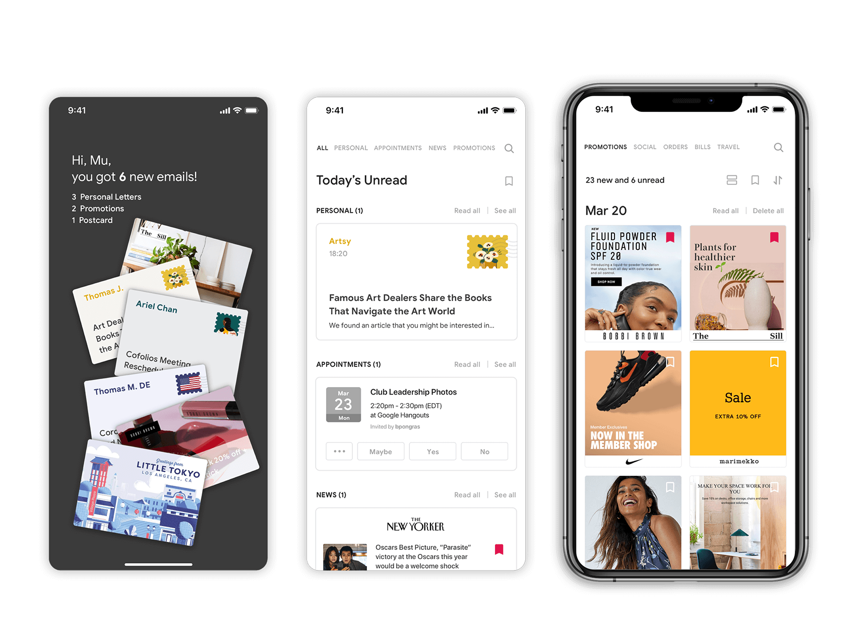
Mimicking the real-world experience on opening mailbox and seeing a pile of letters.

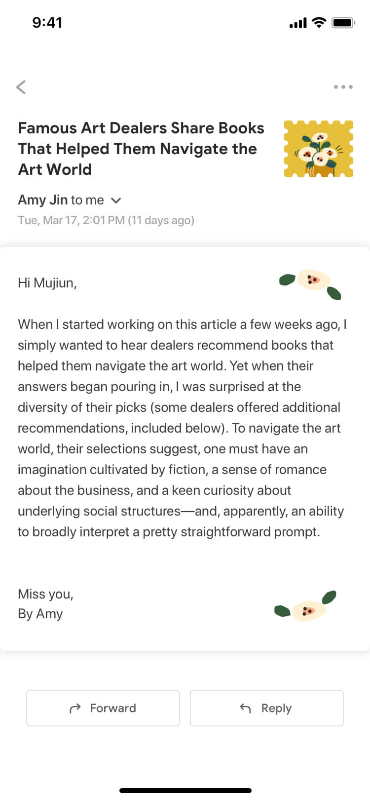
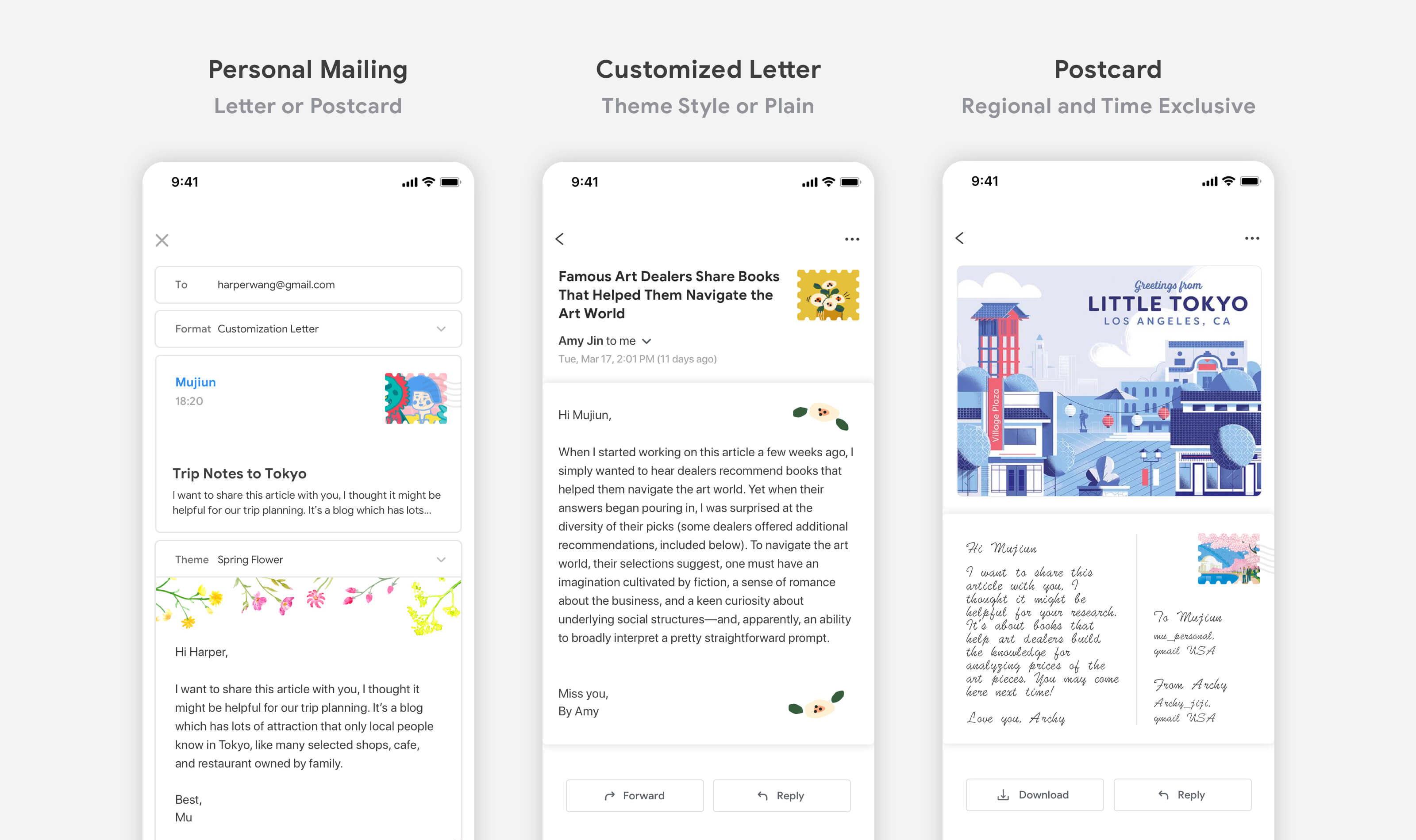
Bring physical mailing experience on digital mailing

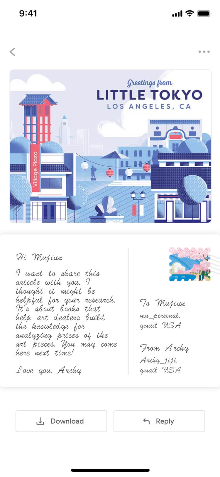
A user can choose a postage stamp and a paper style, or select a digital postcard. The options will be varied by and exclusive to location and time.

#2 Smart categorization and management

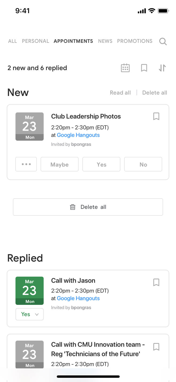
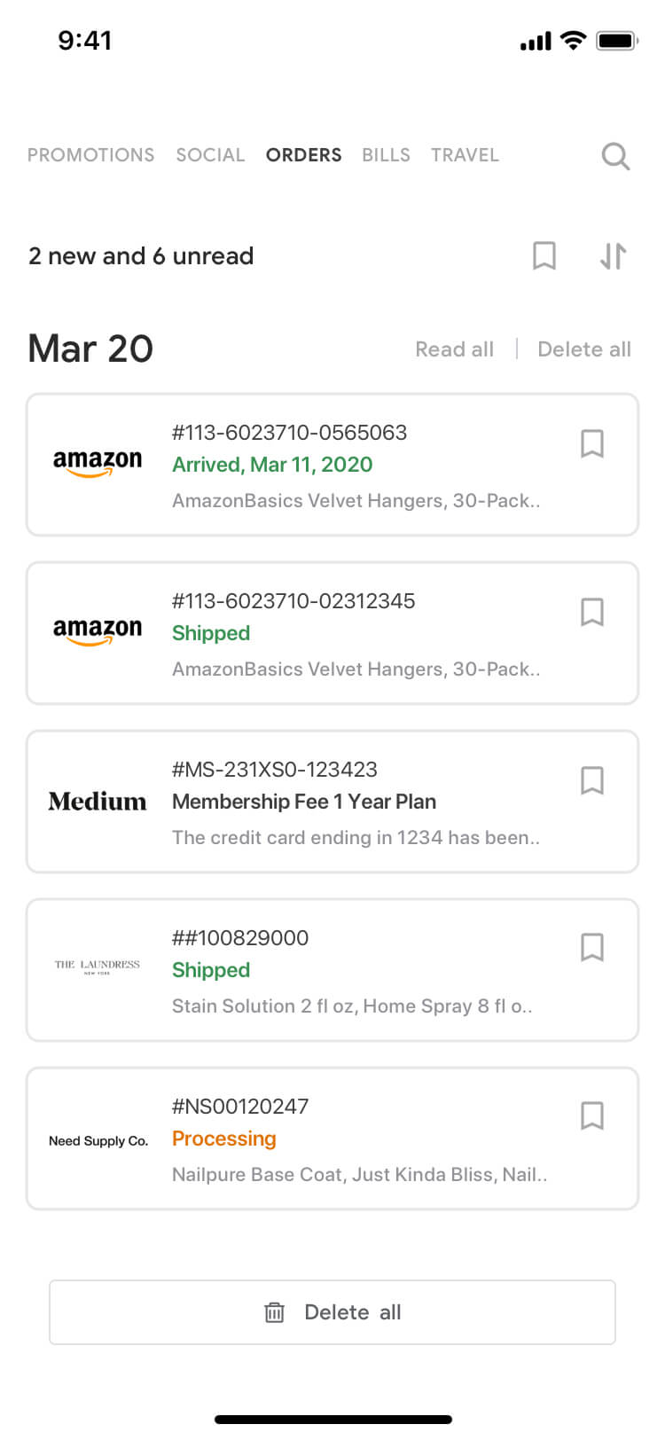
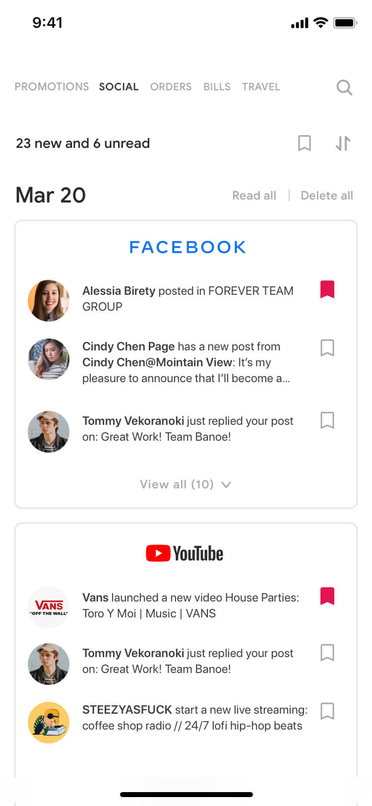
Auto-classify emails by category and date

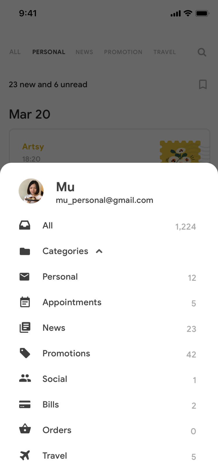
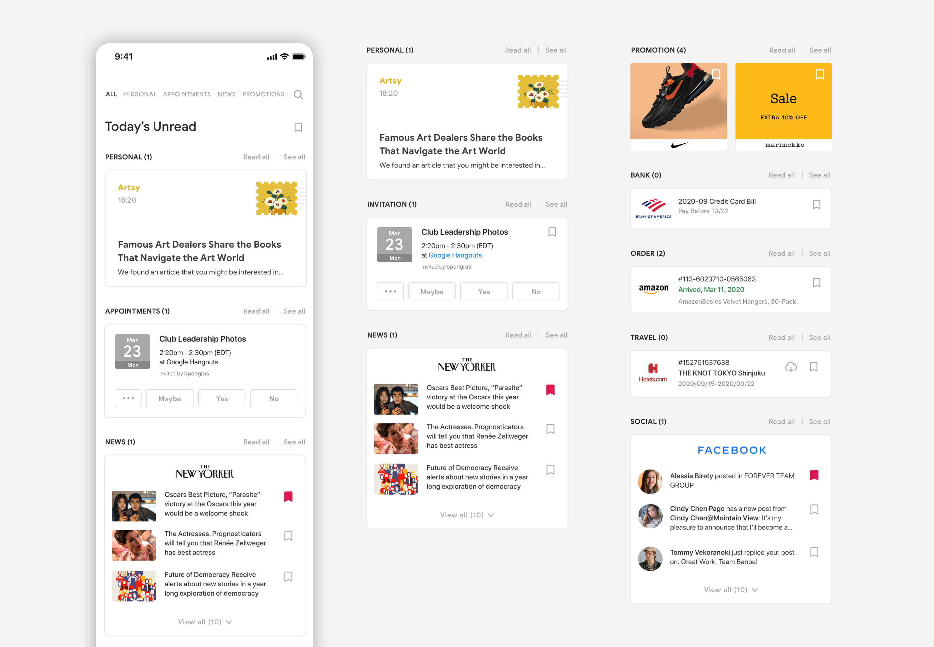
There are 8 default categories which will also show on the top tab. Users can edit the order or remove the item from the tab.

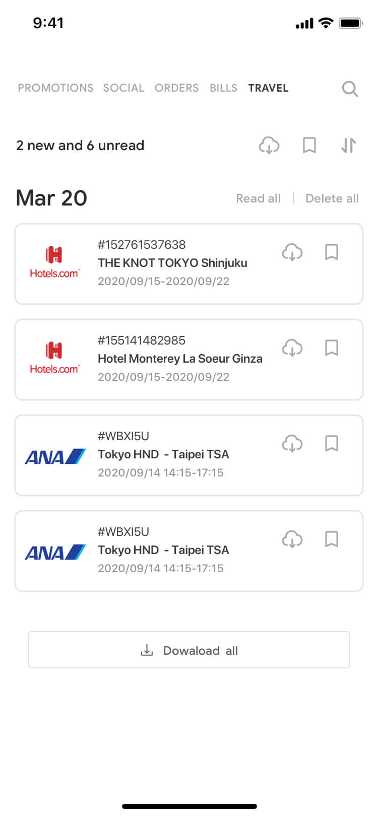
Enable batch-process emails

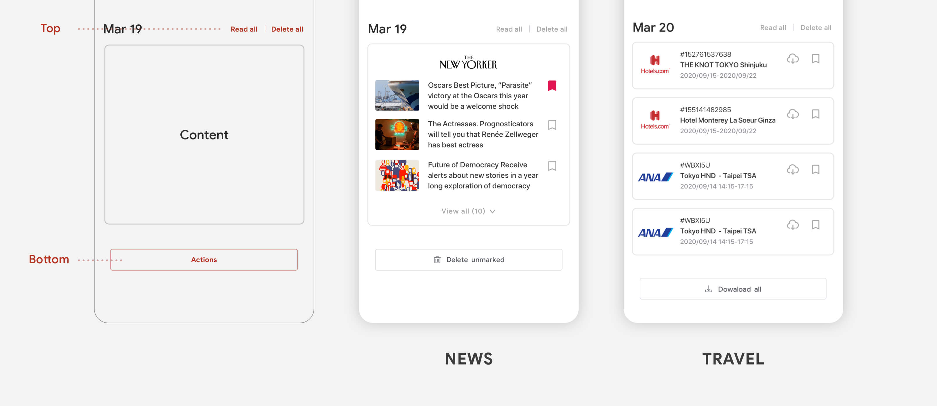
"Read all" and "Delete all" will show before the content. Another buttons for processing emails will show after the content. For example, users delete shopping emails and newsletter frequently, so here I repeat "Delete all" buttons. Users tend to save the travel documents for offline preview, so "Download all" will be needed.

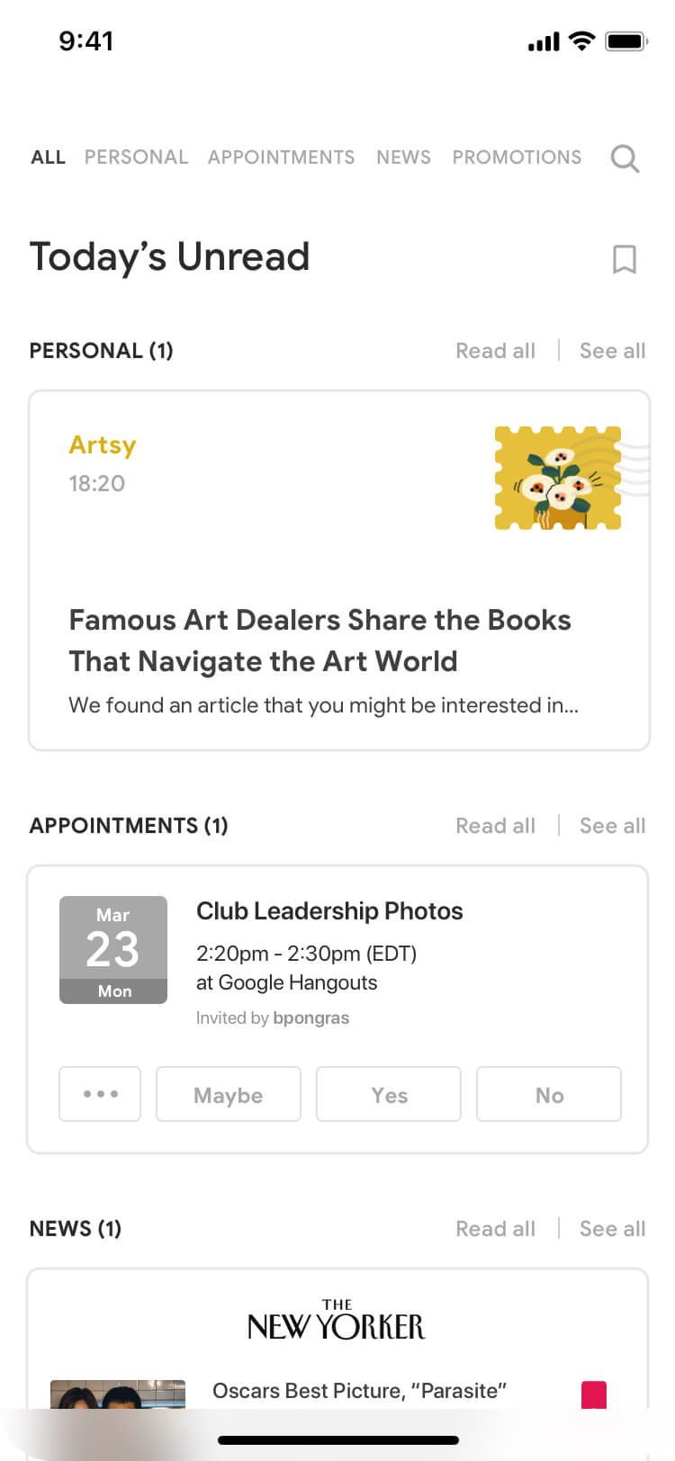
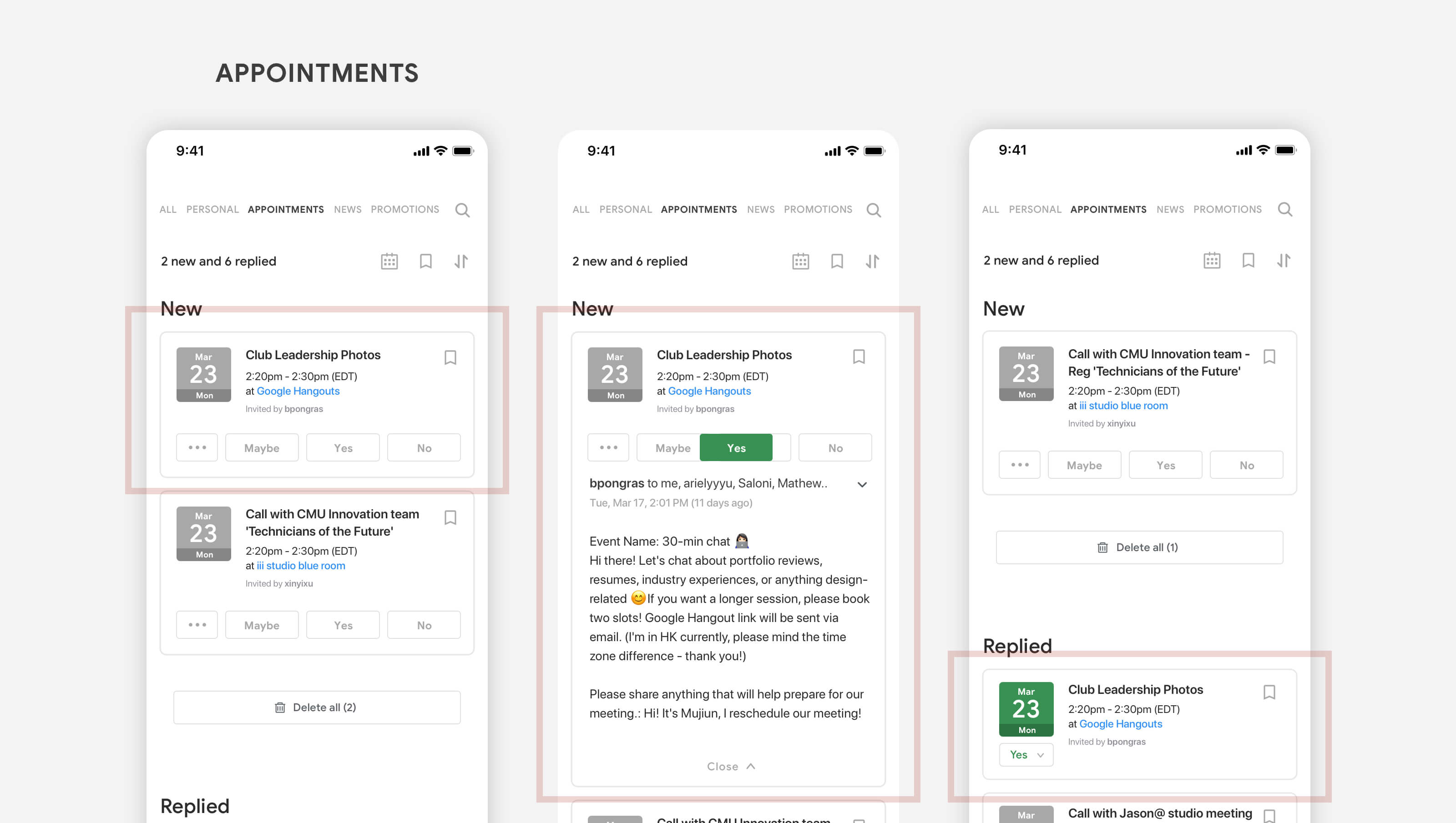
For replying the appointment, users can easily reply without opening emails.

Provide subscription management

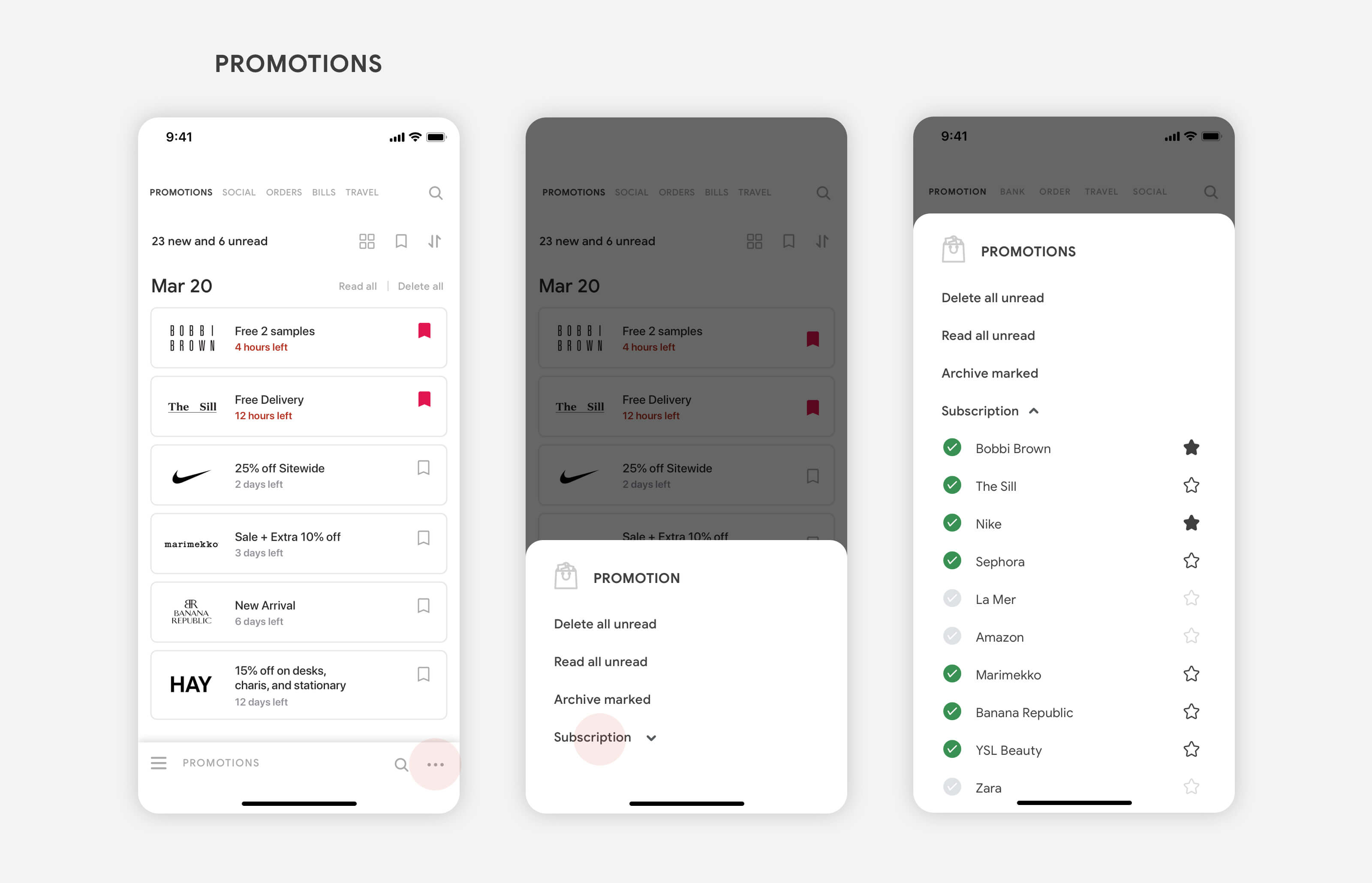
Users can easily manage subscription list, and make important subscription show on top of the list by starring. This features provided in promotions, news, and social.

#3 Tailor layout for readability

Choose layout to fit content

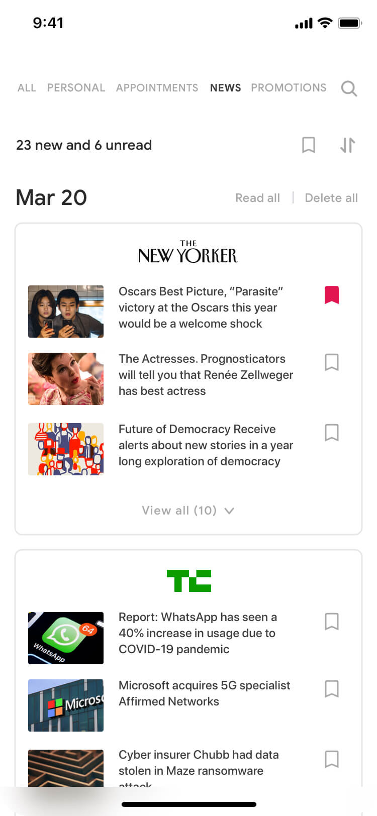
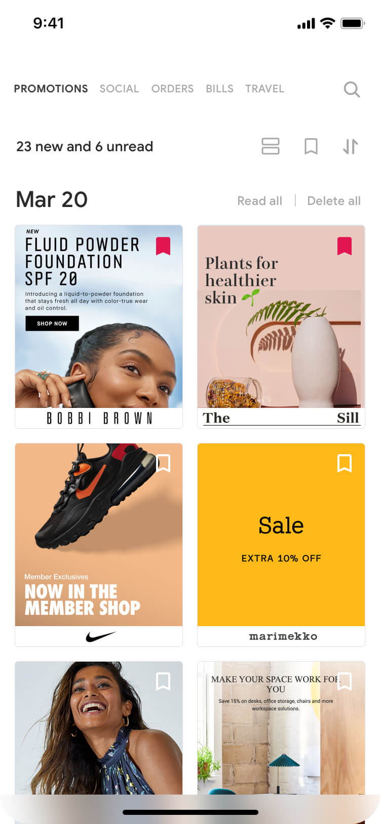
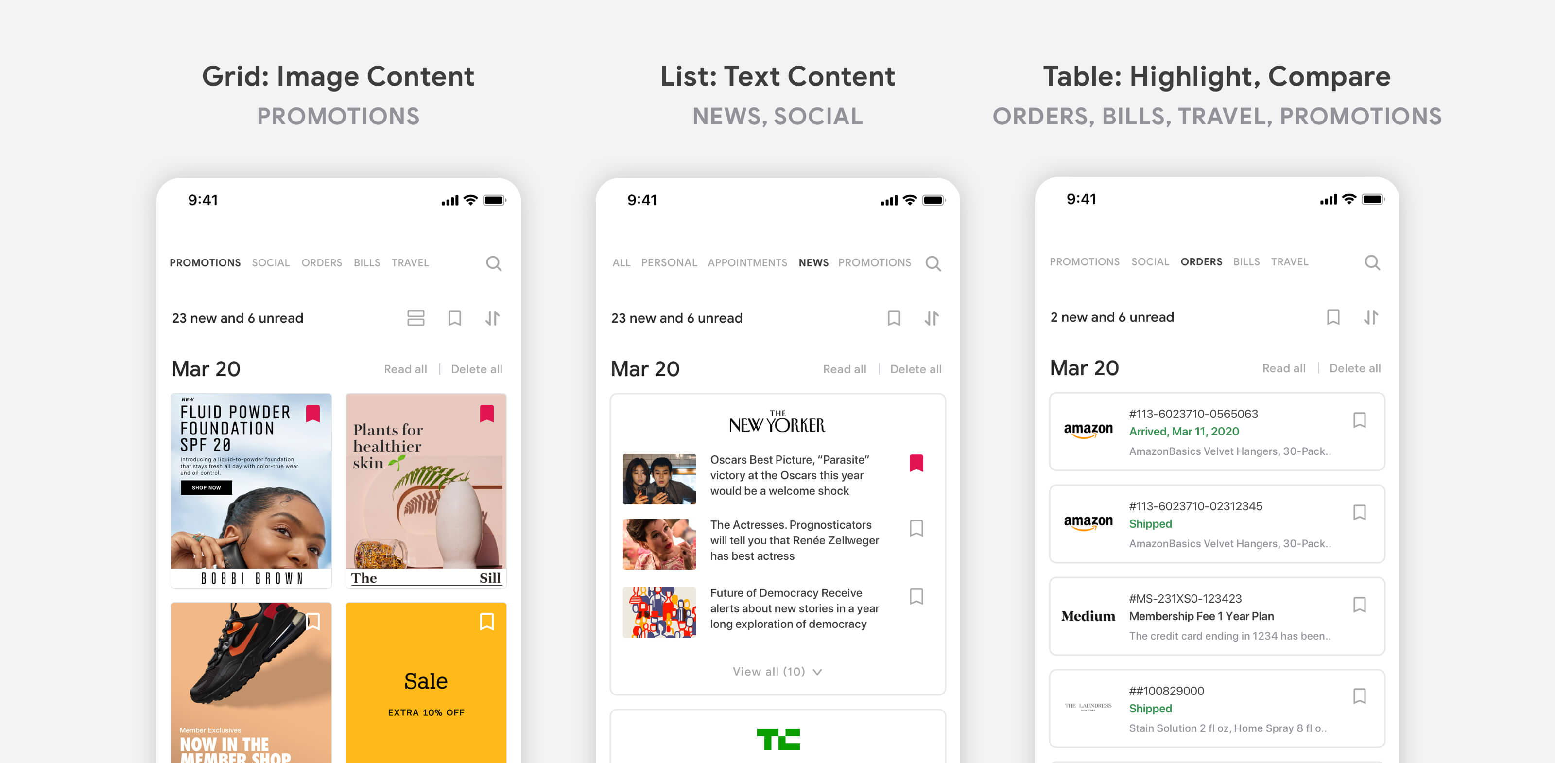
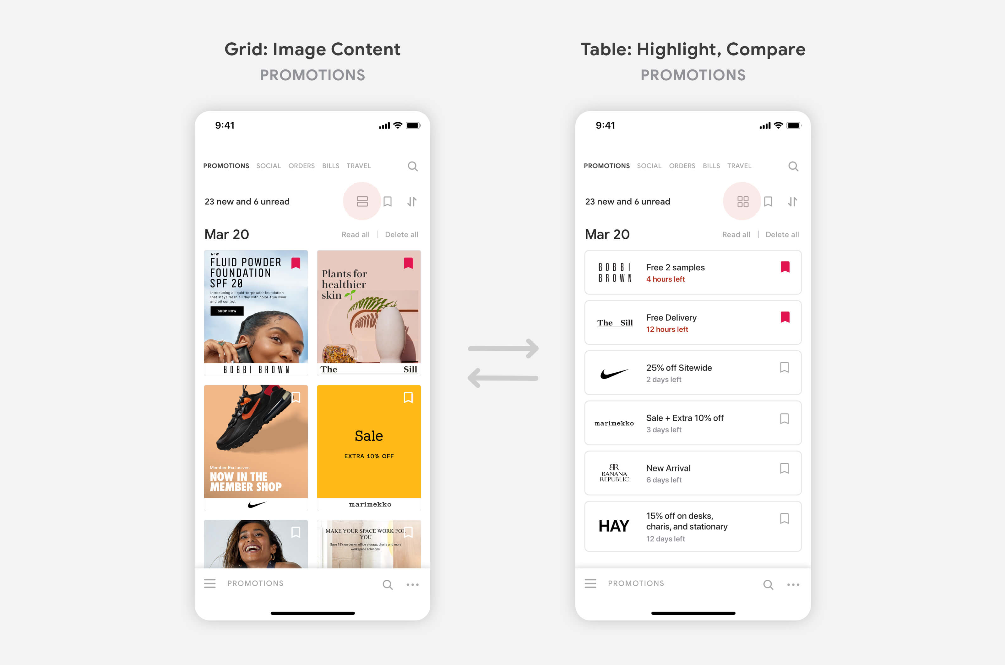
Users can use less effort and steps to process a list of emails. There are 3 types of layout: the grid view for images content like EDM, list view for text content like news, table view for highlighting key content from emails.

On the main page, each kind of unread emails will display on its layout style.

Switch view mode for different purposes

Scroll and explore promotion images or switch to table view to compare the deal.
User Testing

To validate my idea, I found 5 users and did the user testing. They might spend 5-10 minutes on prototype and respond feedbacks.

I was not sure whether people would accept this idea because people might already get used to the current Gmail. However, the result was quite surprised me, all testers said they like the redesign which is very helpful and enjoyable for processing personal emails.

Lessons

Before I did this design challenge, I never thought deeply about my experience of using personal Gmail, but I did feel overwhelmed by processing countless emails every time I opened Gmail. This design challenge helped my practice the ability to "think deeply on users' needs" by analyzing my and users' thoughts. Existed product and data can only limit users' behavior, to solve users' problem and find a better solution, it's important to challenge, even reverse the current design.

Iteration

Due to the time and budget constraint, I was not able to have enough time and resources to work on each phase. For the future iteration, I would like to optimize the interface and features through: (1) more interviewees with the diverse backgroung and age; (2) more user testing to earn feedbacks; (3) cooperate with developer to learn about limitation and feasibility.

END ###