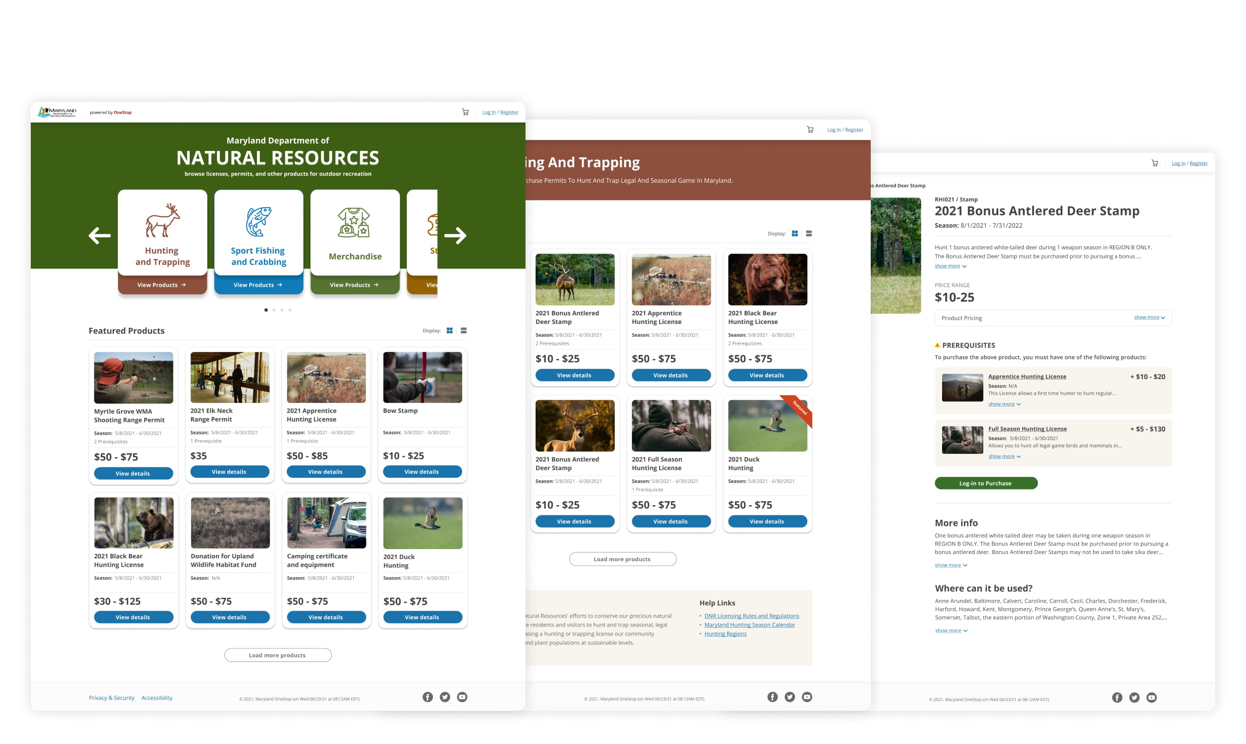

Maryland Department of Natural Resources provides various services on their online portal -DNR Compass including recreational licenses, permits and stamps; off-road vehicle registrations, magazine subscriptions, and donation.
As people get used to easy-to-use eCommerce experience when purchase online, this text-heavy outdated portal no longer meets users' needs. Our goal is to build a more intuitive and streamlined experiences so users can discover product and complete tasks easily.
We interviewed 10 users who purchased hunting licenses on current DNR portal within a year to learn about 4 pain points users have within the journey.
P1 - Login on homepage makes informaion and portal not accessible
P2 - Disconnected navigation makes users go back and forth between pages
P3 - Lack of informaiton requires users additional time on research
P4 - Lack of guidance on verifying certificate and purchase prerequisite
To clarify scope for discovery, I first aligned with team on tasks to focus.
"Where to build features" was still unclear which blocked discussion. To address blocker, I built the "baseline" which echos user needs on eCommerce experience. Baseline could be the starting point to drive research, inspire ideas, facilitate discussion, and shape solution.
When built homepage mockup, I learned that login can impact price display, and this finding drove more research. From competitor research, I cannot find any precedents showing price range before user login, so I eventually turned to client and users to justify this approach.
I've guided the team on research to fulfill the content for product details page.
I've led team discussion on different user flow regarding when to verify certificate and add licenses to cart, analyzed pros and cons, and landed on the final decision.
To pitch our solution and persuade CEO, I've invited relevant stakeholders and mocked up additional concept based on CEO's proposal. By showing 2 concepts to the broader team, I expected to gain more support for my ideas to impact CEO's decision.
And I've successfully pitched our team's idea and changed CEO's mind 🎉
After getting leadership approval, I've worked with PM, Eng, researcher, and visual designer to update pages and planned for user testing to validate designs.
I learned about 2 things from this project:
(1) How to impact leadership decisions through presentation and stakeholders' feedback
(2) How to quickly help team align on one page and clarify ambiguity with baseline concepts